

If you own your home—or even if you rent—you have likely been in the position of needing a fresh coat of paint for your walls. You could just put white up on everything, but which white? There are so many shades from a number of brands.
We recently painted the interior of our 1897 home, and for help selecting the colors, I turned to a friend, Jody Suden, who is a color consultant in Montclair, NJ, where I live. Jody spent hours listening to my preferences, showing me options and teaching me about color theory. Jody chose 19 colors for me, including five pinks, including a deep rose in the dining room (Sherwin Williams Memorable Rose) that matches my Desert Rose Franciscan dishes. Hey, I like pink! Also, our third floor bathroom has three different purples, including an almost-black purple on the outside of the claw foot tub called Galaxy, by Benjamin Moore. It looks incredible.
Our paint colors are beautiful and very specifically my taste, so I thought I would pass on some of what I learned from Jody about choosing colors you will love.
GROK NATION: What is the most important thing to consider when selecting colors for your home?
JODY SUDEN: Light. What kind of light does the room you are coloring receive? A sunny room works easily with any color and with any color value (the light or darkness of a color). A dark room is trickier. Muted colors can look blah in a dark room. But if you turn up the chroma (which is the brightness or muted nature of a hue or color), you can have a beautiful result.
Second thing—be realistic! You have to work with what your furnishings are and what exists in the room, like tile, wood, etc. All the design mags and websites like HOUZZ are highly curated, staged and styled. No one actually lives like that unless you have a flock of minions cleaning up after you and putting your mail away. It took me a while to realize this. Those interior photos are like pictures of supermodels in magazines: No one actually looks like that. So, when a room is painted top to bottom TEAL…take a closer look at why the room works. Maybe the furniture is white or there is a ton of natural sunlight, or the bookshelves have been edited to three beautiful objects. (And all those rooms have abnormally high ceilings and are gorgeous London townhouses. Any color would look fantastic in them.)
Thirdly, know thyself. How high is your color tolerance? Do your research. Look at rooms that you like, figure out why you like them. How much color can you handle? Do you like dark or light colors? Warm colors or cool colors?
How can people find a professional to help with this?
To find a professional, I’d ask around, look on Houzz, google color consultants in your area. Ask for references, and see what their past work is. Lots of great designers and color consultants might not have a degree; they just have an amazing sense of style, taste and or color.
What if one can’t afford, or doesn’t want, to hire a professional color consultant?
Ask a friend who’s good at color/you like the colors in his or her house, to help you.
There are so many colors–how do you narrow down the options and avoid choosing the wrong one?
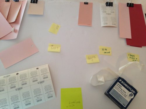
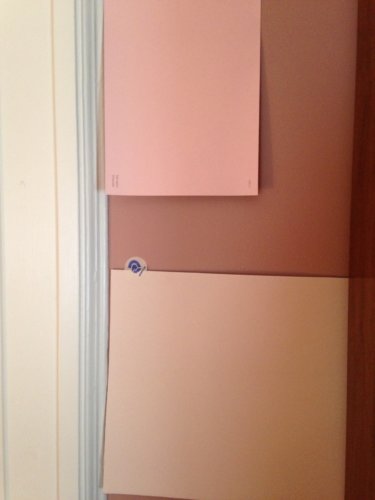
Use the tools on a paint company website (Benjamin Moore and Sherwin Williams, for example) to download a photo of your room and then ‘color’ it. This can help you decide whether you want a blue room or a yellow one. Big choices. I don’t trust that the blue I use on the computer will look good in my room until I swatch it, which means to buy a sample of the color and paint it on a white foam core board or right on the wall of the room that you are painting.
You could also use a paint company’s Historic Collection. Both Sherwin Williams and Benjamin Moore have historic colors that are a great jumping off point. Or look at smaller boutique paint collections like Farrow & Ball. They have narrowed down their selection to a few good blues, greens, neutrals etc. You could “Google Image” a color you like, to look at rooms painted in that color. Another option is to look at design magazines that list what a color is and then buy a sample can and swatch (paint) it up on your wall. Look at it over the course of a few days in different lighting to see if you like it.
Can you suggest some foolproof colors?
Yes! Benjamin Moore White Dove (OC-17) is a beautiful clean white. Benjamin Moore HC 144 is a gorgeous pale bluegreen. Farrow and Ball Pink Ground is a sophisticated pink that could be in a living room, or office or bedroom and not come across as “little girl.” Benjamin Moore Gray Owl is a super popular ‘warm’ gray that is easy to live with.
What types of colors are tricky or best to avoid?
Bright colors are harder to live with in the long run because they are constantly ‘talking’ to your eyes. Your eye physically gets tired of them. They are always giving something back. That said, you can do a bright color in a dark room because the lack of lighting smooths out the brightness.
What color do you think is best for ceilings?
I love a colored ceiling! I can’t wait to do a pink ceiling, but right now, I have blue ceilings all over my house. They make me think of the sky. Ceilings are a great place for color. It’s unexpected and it’s a way to layer in MORE color to a room. It can also function to calm down lively walls, or be a super pop to a neutral room.
We used to do crisp white on a ceiling, but I’ve noticed that lots of older ceilings have a ‘white’ that looks dingy and gray. This is the “ceiling white” that your paint contractor recommends. They have it in buckets in their trucks. I like to use the white of the trim, say White Dove, and put it on a ceiling in flat finish. One can also “cut” one’s wall color by 50 percent to be a lighter ceiling. (I usually don’t work in percentages, but I know designers/clients who do.)
Are accent walls a good idea? In what types of rooms?
Accent walls were very trendy in the ‘90s. It was a way to get color into a room but not kill you with color. Since they were such a thing, I find that people have moved away from using them. However, a kid’s room, which is probably going to change sooner rather than later, is a fun place to try out an accent wall. Now, I see “accent” walls in kitchens that are tiled from floor to ceiling, or an accent wall in a foyer or living room might be wallpapered. Accent walls look great in attics where there is a sloped ceiling. You do the accent color on the flat walls, that are holding up the sloped ceiling. They can act like bookends of color. Another great place for an accent that I have been seeing is the wall leading up the staircase to a second floor, or a color at the end of a hallway or staircase. It draws you up and into the next space. Accent walls can still be done artfully.
What about finishes? How does one decide what the best finish is for certain colors?
Finishes haven’t changed much over the years for me—flat or matte for walls and ceilings, semi-gloss for trim. I actually did a satin finish (at the suggestion of my non-color consultant husband) on my blue living & dining room ceilings because they were freshly renovated and perfectly smooth plaster. They look terrific and the light bounces a bit more off the finish. Always a good thing to have light bouncing in a room.
Grok Nation Comment Policy
We welcome thoughtful, grokky comments—keep your negativity and spam to yourself. Please read our Comment Policy before commenting.